

Welcome to Aftermarket Report, a newsletter where we do a quick daily wrap-up of what happened in the markets, both in India and globally.
We’re trying out a new format for the Aftermarket Report, with much more comprehensive coverage of the data that shapes the trading day. Beyond the headline indices, we’re now looking at market breadth, new highs and lows, sector and thematic performance, delivery data, F&O positioning, global markets, commodities, flows, and more.
The idea is to bring different datasets together in one place and help traders and investors get a clearer picture of what’s actually happening beneath the surface of the market.
This is still a work in progress, so we’d really love your feedback. Tell us what you found useful, what you didn’t, what felt unnecessary, and what else you’d like us to add. Your feedback will help us shape the Aftermarket Report from here.
Markets Today
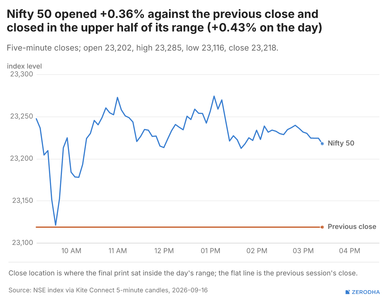
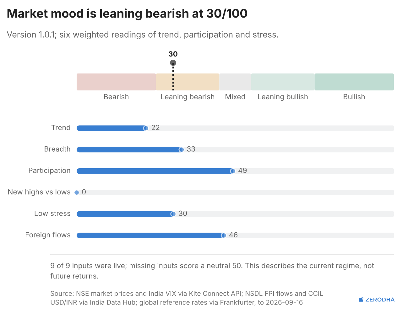
Nifty opened with an 83-point gap up at 23,202, ahead of the key FOMC meeting, as global equities consolidated while crude oil prices remained firm above $107 per barrel. The index saw sharp volatility immediately after the open, briefly rising towards 23,250 before reversing and plunging to an intraday low near 23,120 within the first half hour.
However, the fall was quickly bought into, with Nifty recovering above 23,200 by around 10 AM and extending the rebound towards 23,260-23,270 by 11 AM. It then gave up some gains and moved back towards 23,220-23,230 by the end of the first half.
The second half remained equally choppy. Nifty initially climbed back towards 23,260, before another sharp move around 1 PM briefly took the index to the day’s high near 23,280. The gains again proved difficult to sustain, with Nifty falling towards 23,215 before recovering.
The final couple of hours were relatively calmer, with the index largely consolidating in the 23,220-23,245 range as traders remained cautious ahead of the Fed decision. Nifty eventually closed at 23,217.60, around 16 points above its opening level, after a highly volatile but largely directionless session.
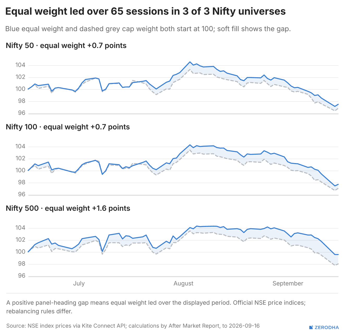
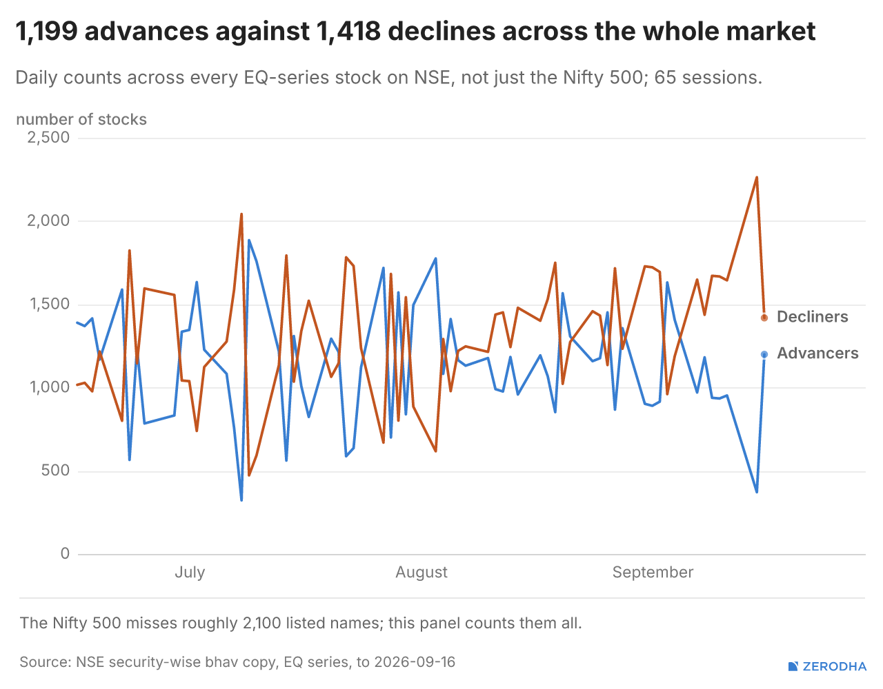
Market Breadth
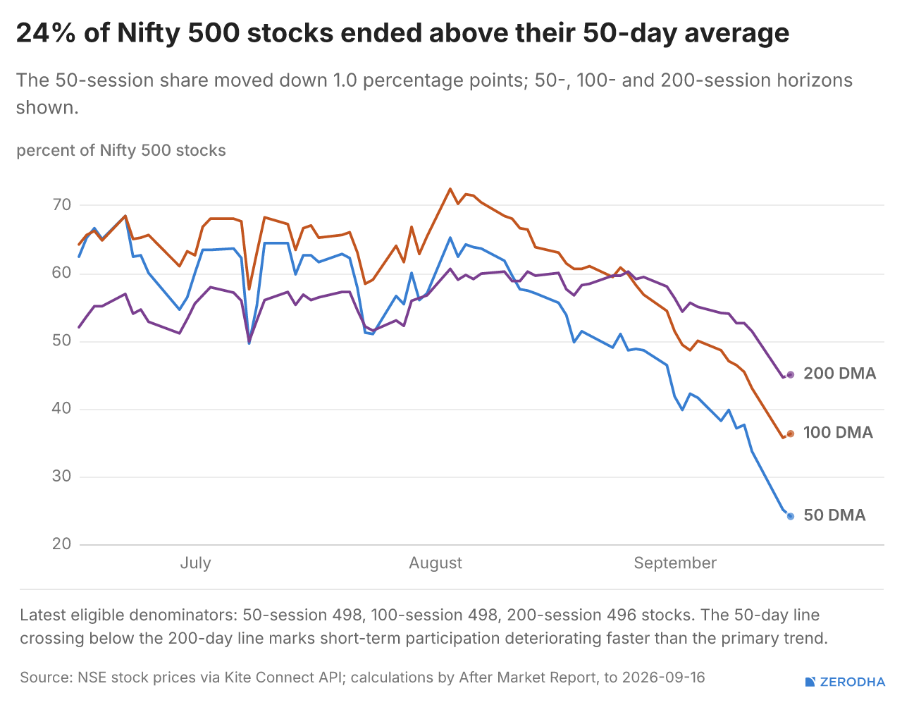
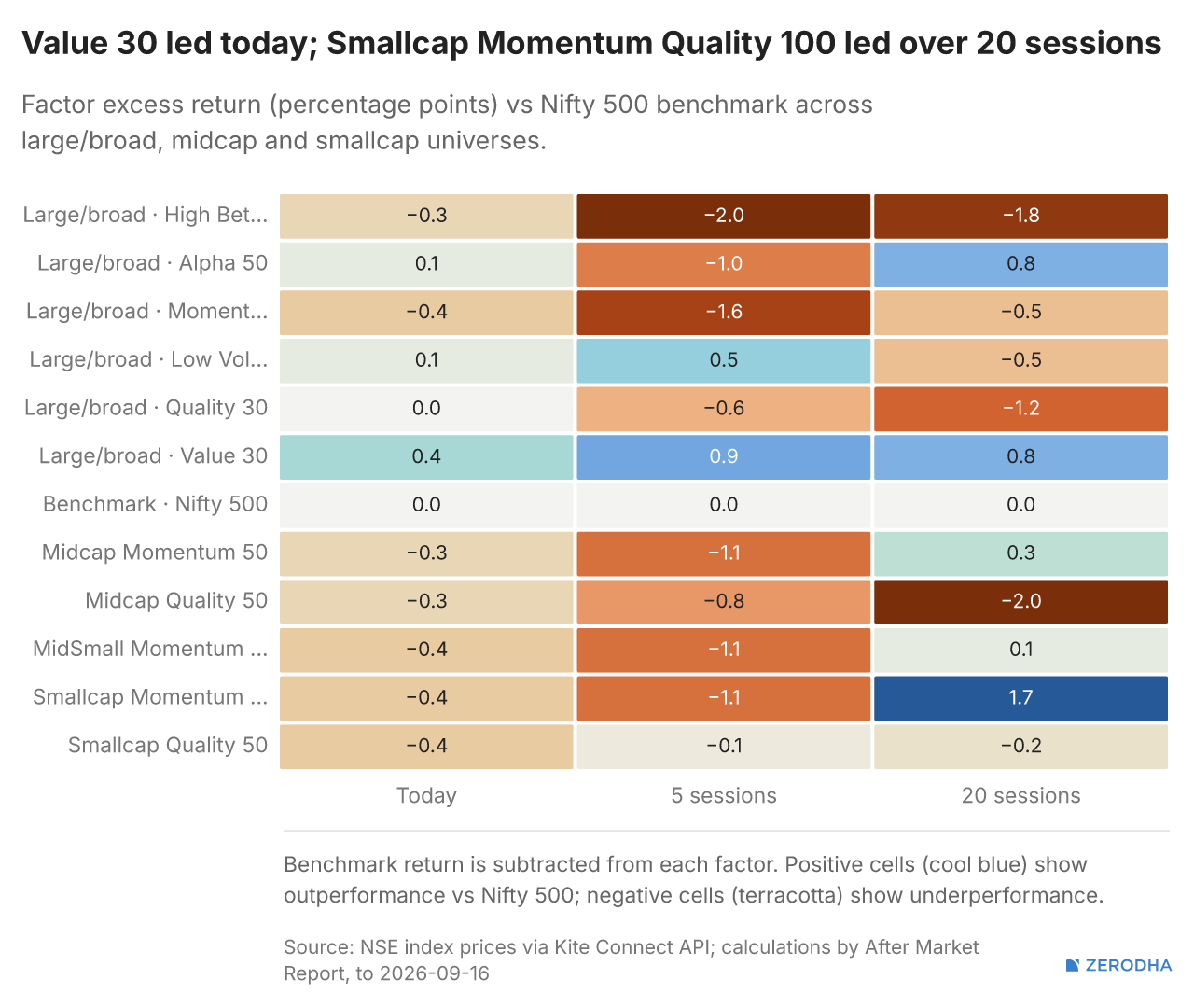
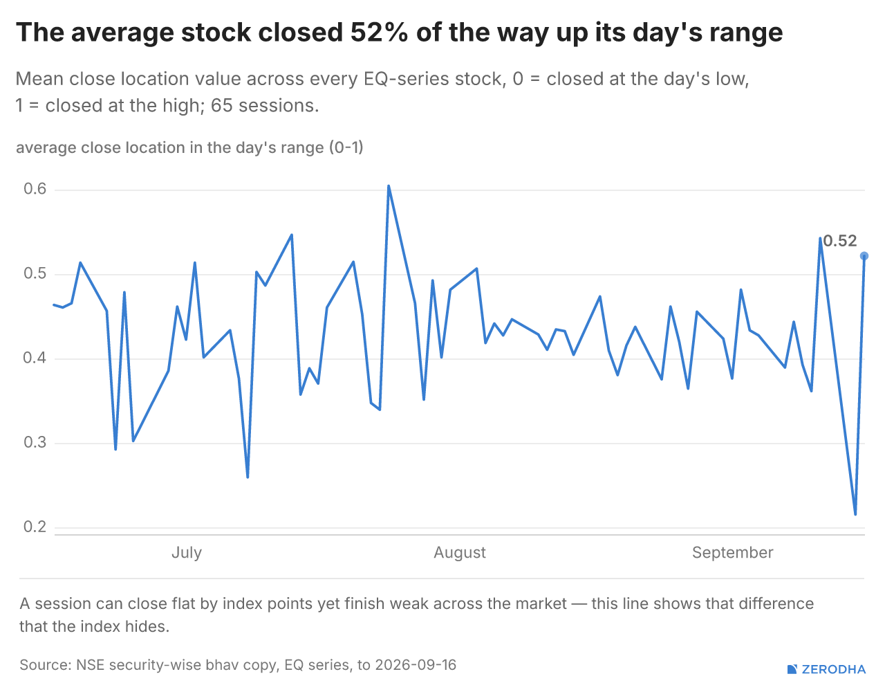
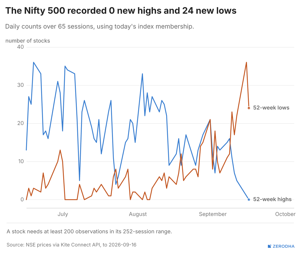
52 Week Highs & Lows
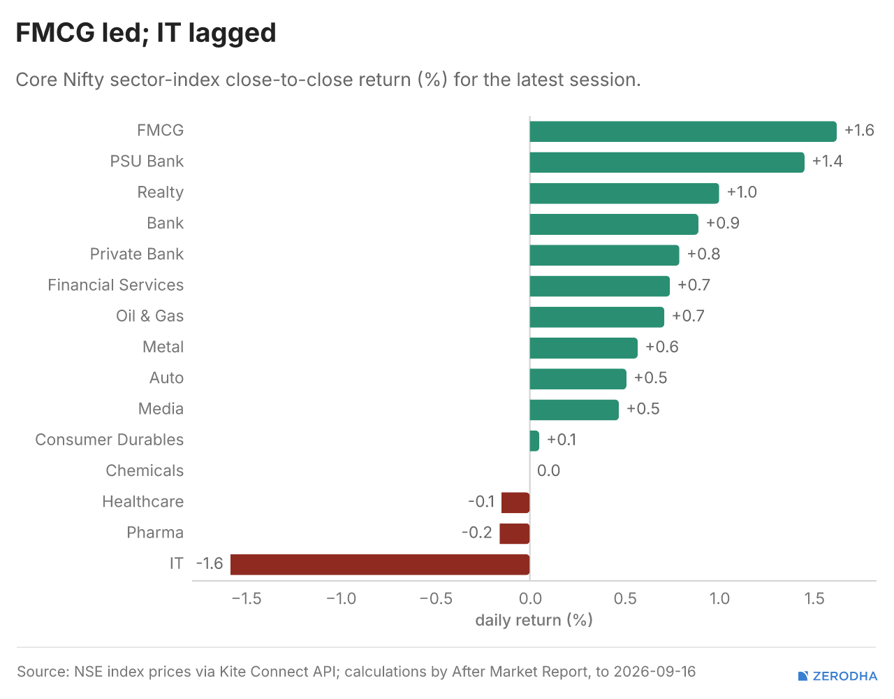
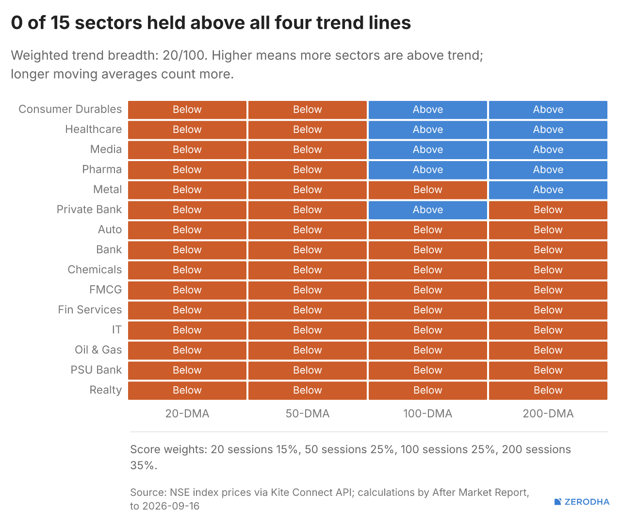
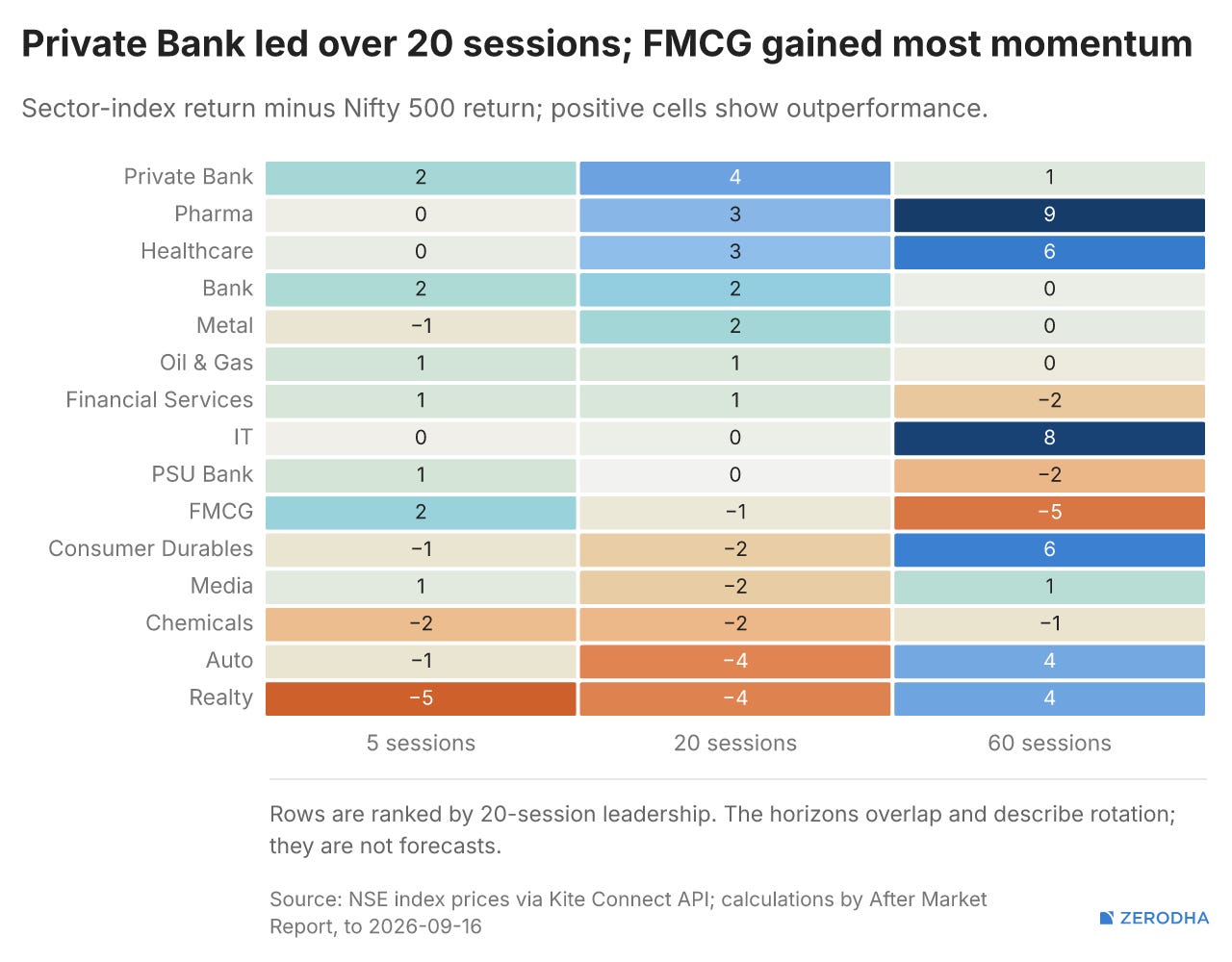
Sectoral Indices Performance
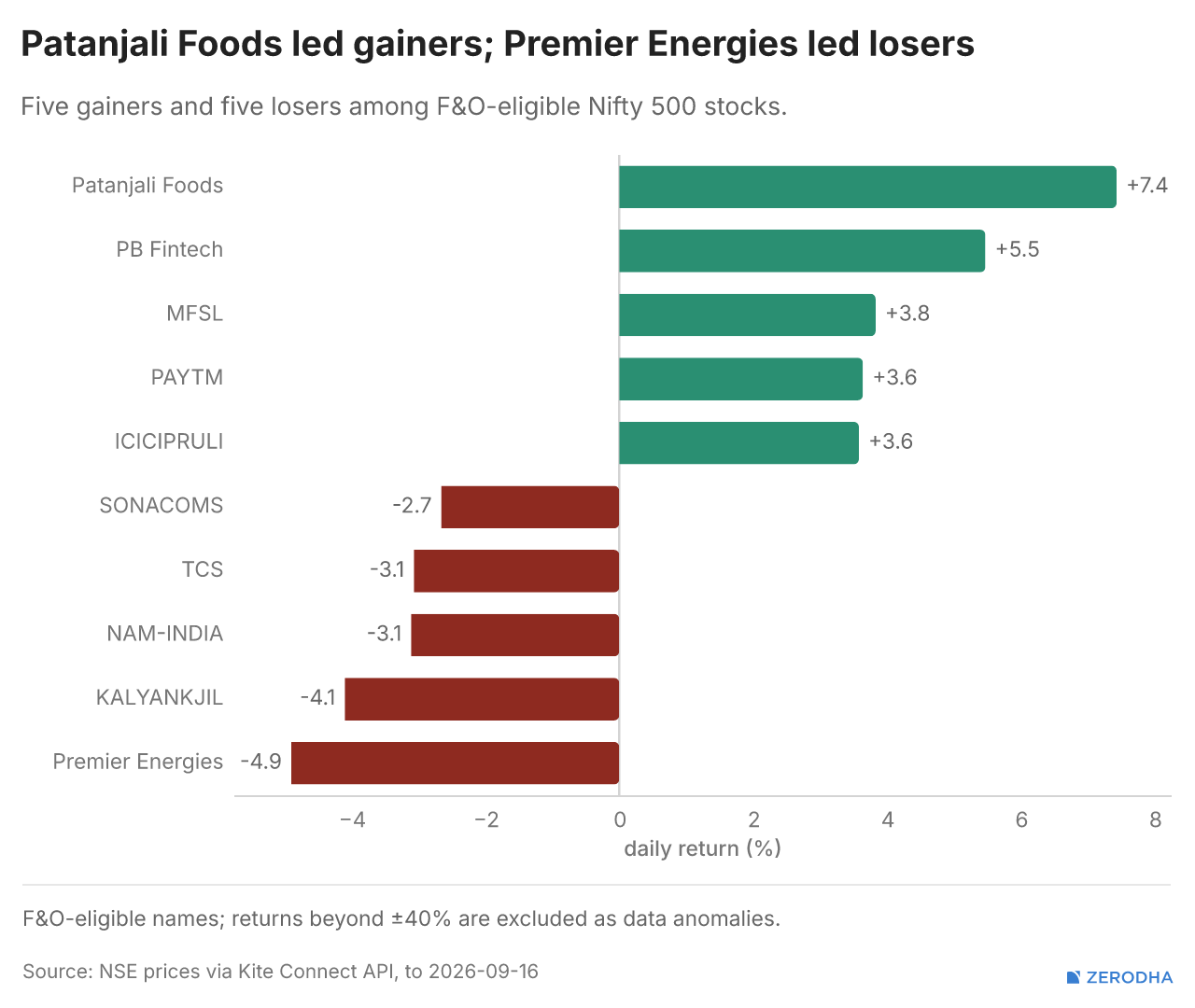
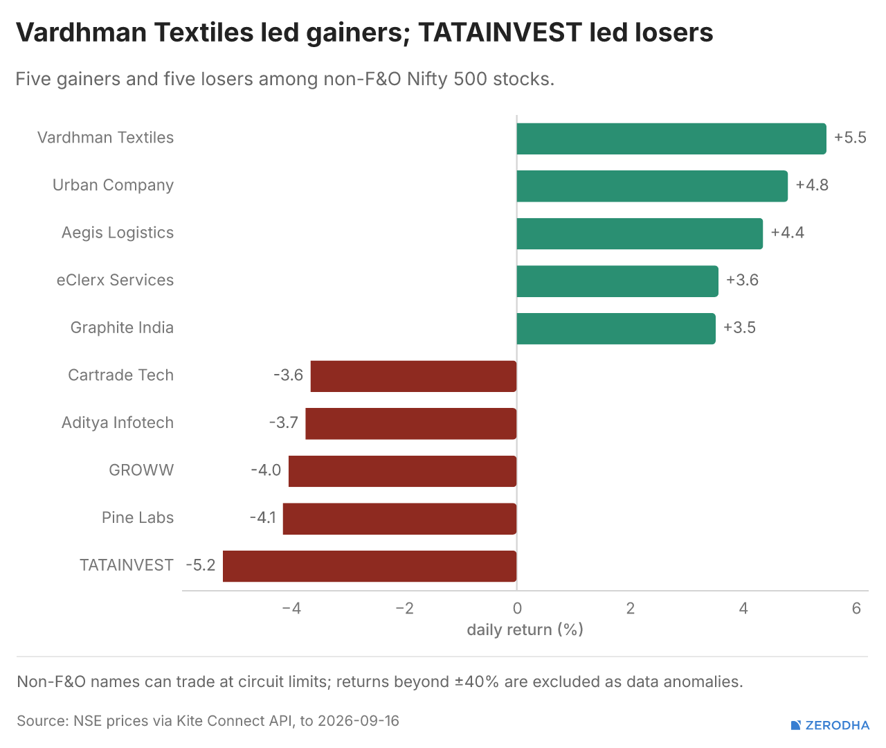
Winners & Losers
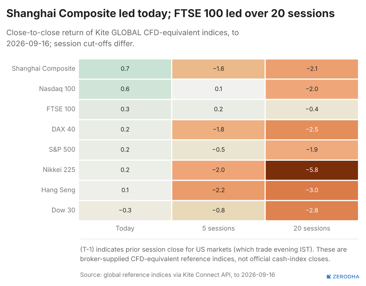
Global Markets
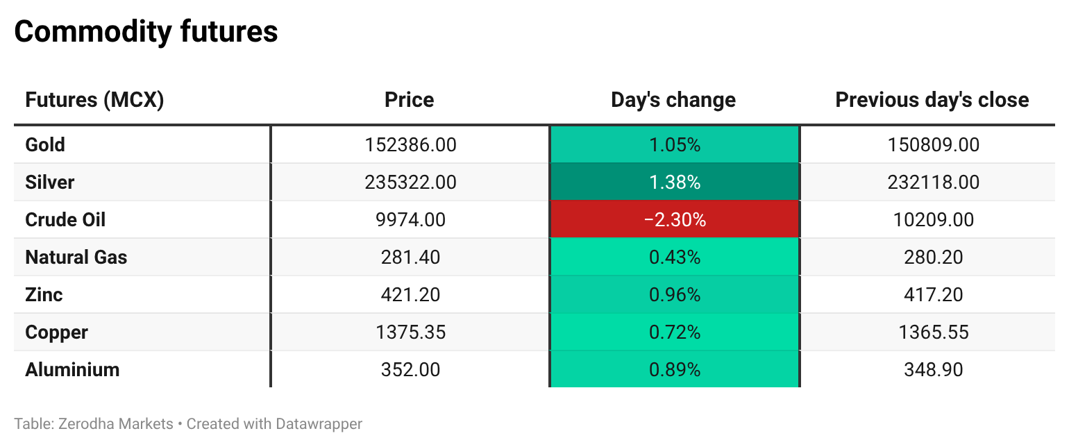
Commodities
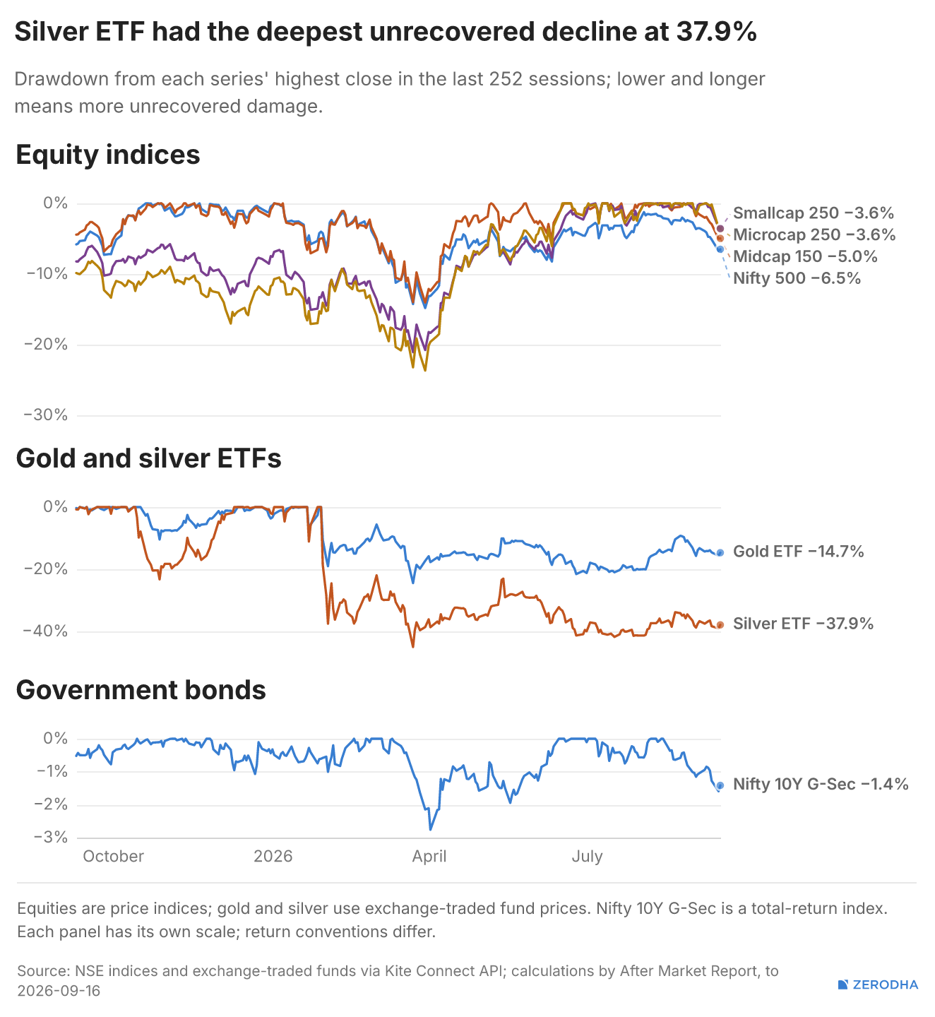
Cross-Asset drawdowns
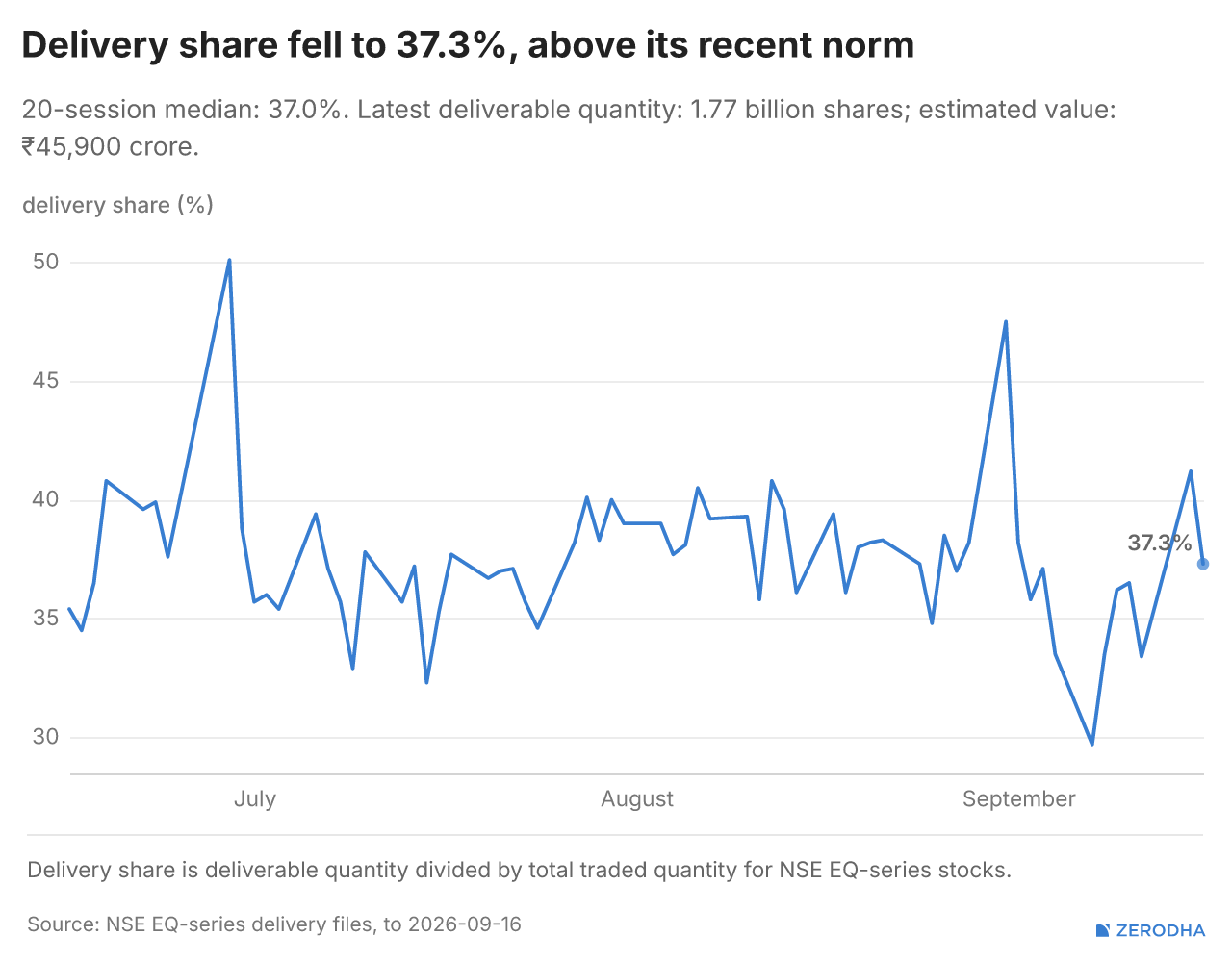
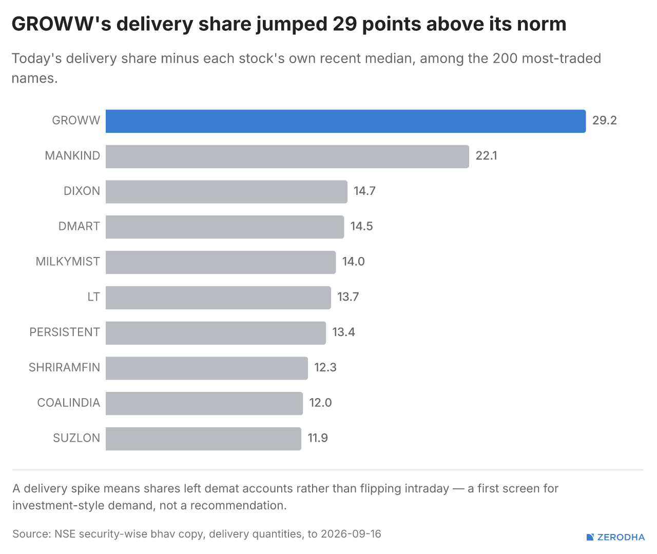
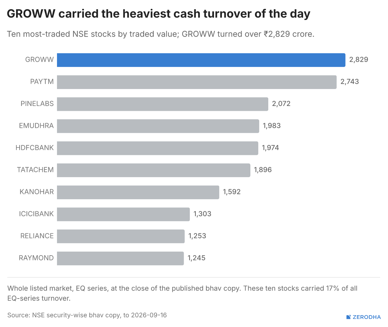
Delivery Data
FII / DII Flows
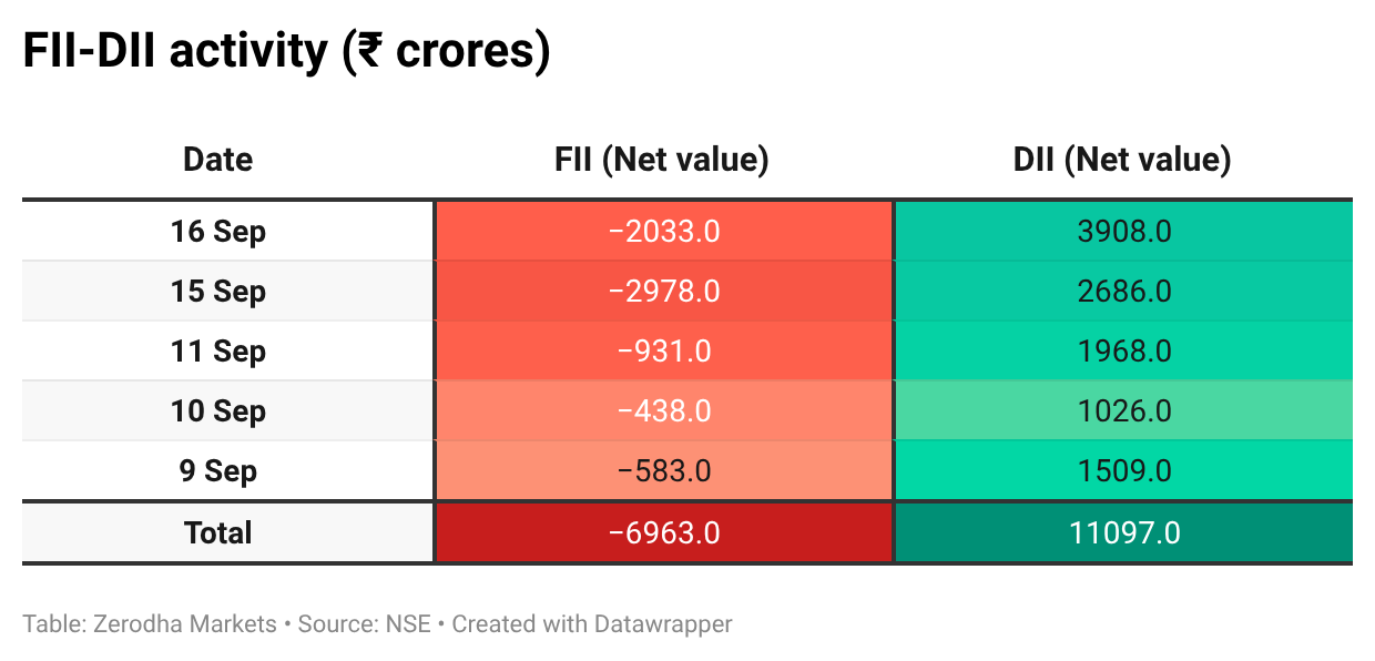
Here’s the trend of FII-DII activity from the last 5 days:
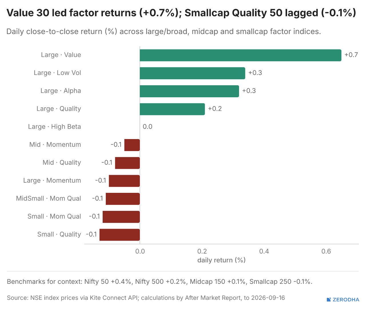
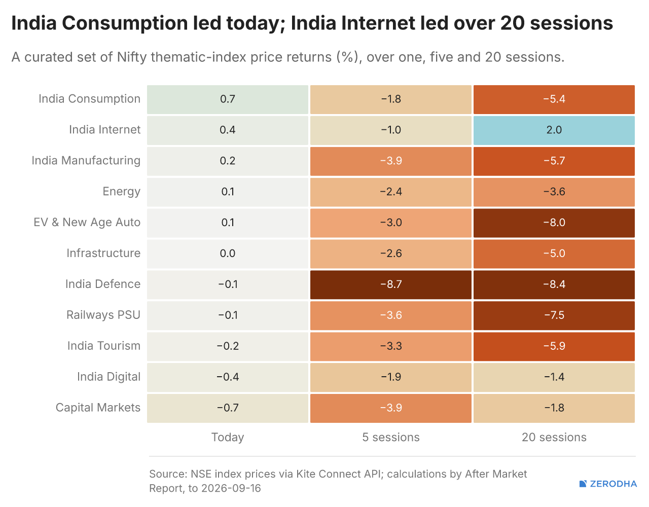
Thematic Indices
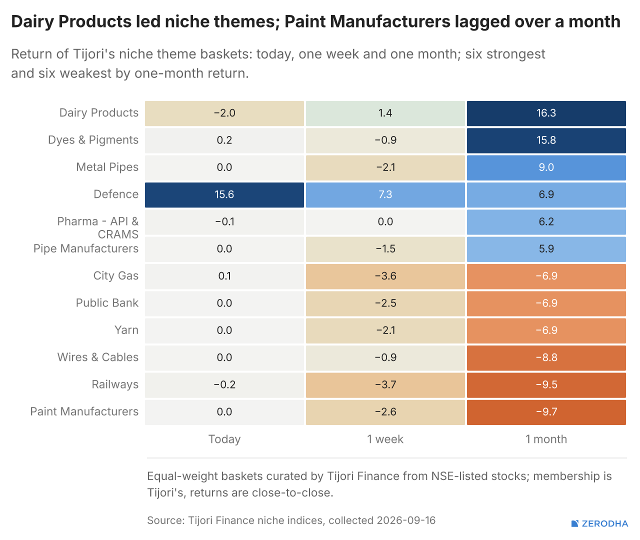
Tijori’s niche indices, where today’s move sorts pockets of the market beyond standard sector baskets. You can also track promoter buying and other interesting stuff, like Capex activity by the companies in the Tijori App’s idea dashboard
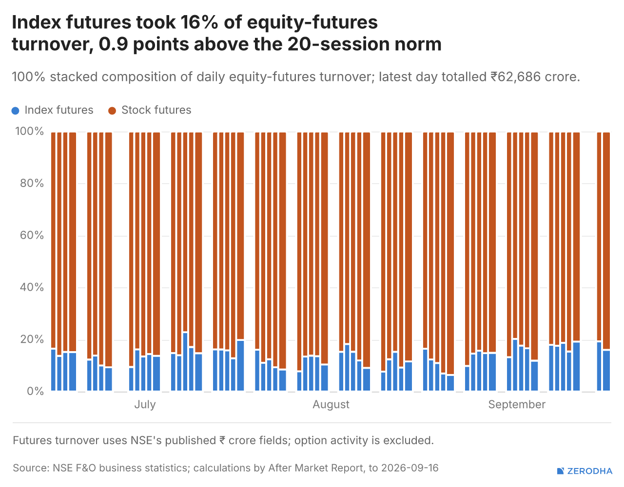
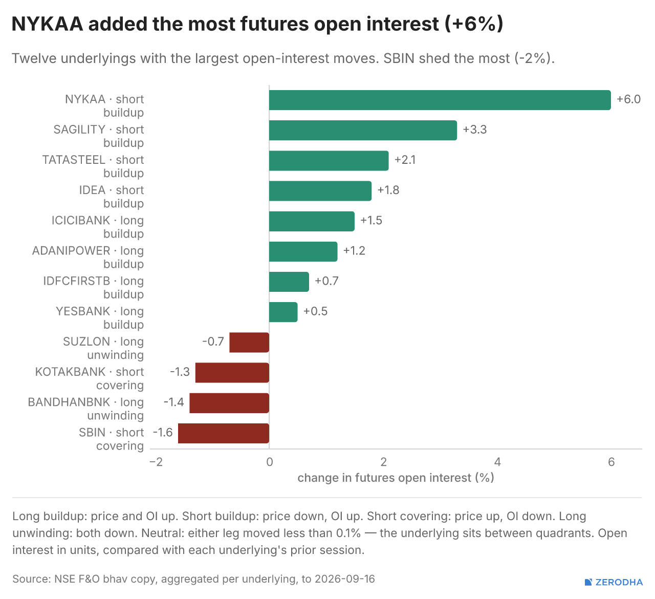
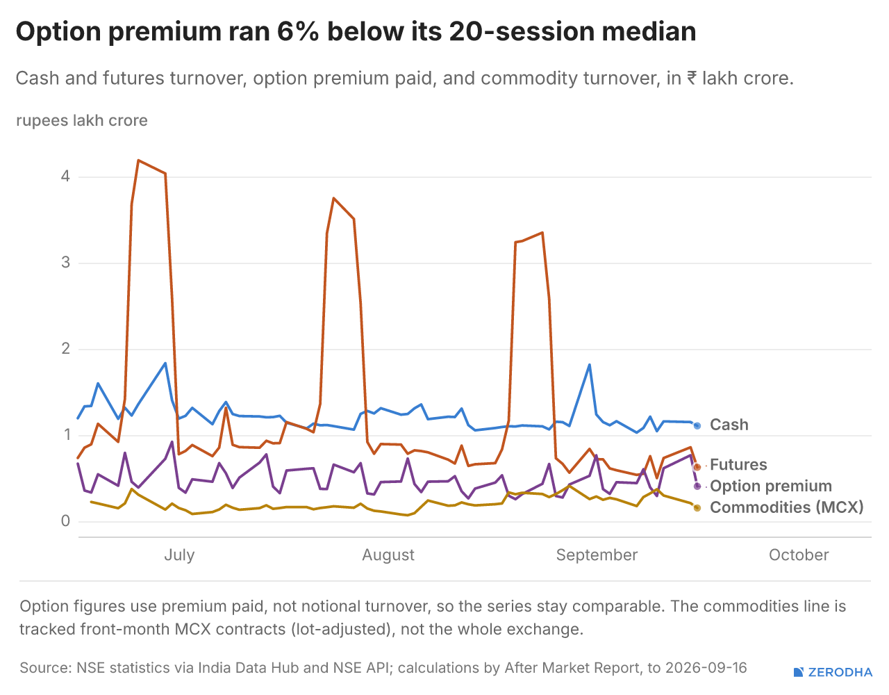
F&O Corner
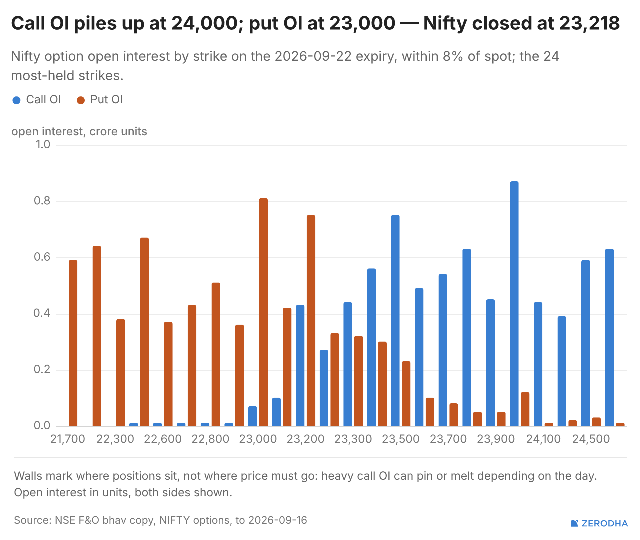
Change in OI for the day
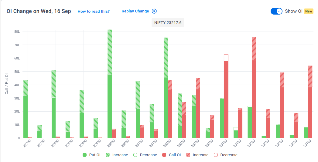
The following is the change in OI for Nifty contracts expiring on 22nd September:
The maximum Call Open Interest (OI) is observed at 23,500, followed by 23,400, indicating potential resistance at the 23,400- 23,500 levels.
The maximum Put Open Interest (OI) is observed at 23,000, followed by 23,200, suggesting support at 23,000-22,900.
Note: OI is subject to multiple interpretations; however, generally, an increase in Call OI indicates resistance in a falling market, while an increase in Put OI indicates support in a rising market.
Source: Sensibull

Top Stories in India
The government’s new UPI MDR framework introduces a lower fee for payments related to mutual funds, securities, stockbrokers and dealers, with such transactions attracting an MDR of 0.02%, capped at ₹300 per transaction. This compares with the standard 0.4% MDR on person-to-merchant UPI transactions above ₹2,000. Dive deeper
The RBI absorbed ₹2.90 lakh crore of surplus banking-system liquidity through two VRRR auctions. Banks parked ₹2.50 lakh crore in the first auction and ₹40,302 crore in the second, both at 5.24%, as the central bank continued operations to manage the large liquidity surplus in the banking system. Dive deeper
Godavari Biorefineries shares surged after the company secured a patent from the Chinese Patent Office for an antiviral compound. The patent covers the company’s novel molecule for treating viral infections, strengthening its intellectual-property portfolio. Dive deeper
The Union Cabinet has raised the monthly wage ceiling for mandatory EPF coverage from ₹15,000 to ₹25,000, the first revision in over a decade. The move is expected to bring more than 51 lakh additional employees under mandatory EPFO coverage, significantly expanding the reach of retirement and social-security benefits. Dive deeper
Jewellery stocks fell after the Bureau of Indian Standards raised gold hallmarking charges by 67% to ₹75 per article from ₹45, effective immediately ahead of the festive season. Kalyan Jewellers and PC Jeweller declined around 3–5%, while newly listed Lalithaa Jewellery Mart hit its 5% lower circuit. Hallmarking charges for silver were unchanged at ₹35 per article. Dive deeper
Top Stories Globally
Oil prices eased, with Brent falling 0.5% to $108.16 per barrel and WTI slipping to $104.63, after reports that Saudi Arabia was offering additional crude cargoes through Oman, easing some concerns over Middle East supply disruptions. However, European diesel prices remained near record highs, highlighting continued tightness in fuel markets despite the pullback in crude. Dive deeper
The Federal Reserve is expected to raise interest rates by 25 bps to 3.75–4.00%, which would mark its first rate hike since 2023. The expected move comes as inflation remains above the Fed’s 2% target, with elevated oil and energy prices following the Iran war adding to price pressures and complicating the economic outlook. Dive deeper
Meta Platforms plans to roll out its next-generation Arke and Astrid AI inference chips in 2027, as it seeks to reduce its dependence on Nvidia hardware and lower the cost and energy consumption of running AI workloads in its data centres. Arke is expected to deploy around mid-2027, followed by Astrid toward the end of the year, further expanding Meta’s in-house AI chip programme. Dive deeper
The U.S. House advanced a bill that would give President Donald Trump authority to impose tariffs of up to 100% on goods from India, China and other major buyers of Russian oil and gas, while also expanding sanctions on Russia and Iran. Dive deeper
Chinese investors are rushing into overseas assets, particularly U.S. equity funds, after Beijing raised the QDII outbound investment quota by $6.8 billion to a record $183 billion. Demand has been so strong that a Nasdaq 100-tracking fund raised its daily investment limit from 10 yuan to 5,000 yuan on September 9, only to slash it back to 100 yuan the next day, highlighting pent-up demand for foreign assets amid rock-bottom domestic yields. Dive deeper
UK inflation accelerated to 3.1% YoY in August from 2.9% in July, reaching a five-month high, as higher energy costs continued to feed into consumer prices. Transport inflation jumped to 4.6% from 3.6%, driven mainly by rising motor-fuel prices, adding to pressure on the Bank of England’s interest-rate outlook. Dive deeper
Management Chatter
In this section, we highlight interesting comments from management at major companies and from policymakers in the Indian and Global Economies.
Union Finance Minister Nirmala Sitharaman on Tax policy:
“Tax policy should not add to those challenges or become a deterrent to investment, enterprise, and innovation. It must provide the revenues required for our development while remaining fair, predictable, administrable, and supportive of economic activity.” - Link
Sameer Nigam, Founder & CEO, PhonePe, on the proposed MDR:
“Even a 0.4% MDR—which, by the way, is still the lowest of all MDR regimes in the world—even this number at India’s population base should hopefully generate meaningful revenue, which will help offset a lot of our expenses.” - Link
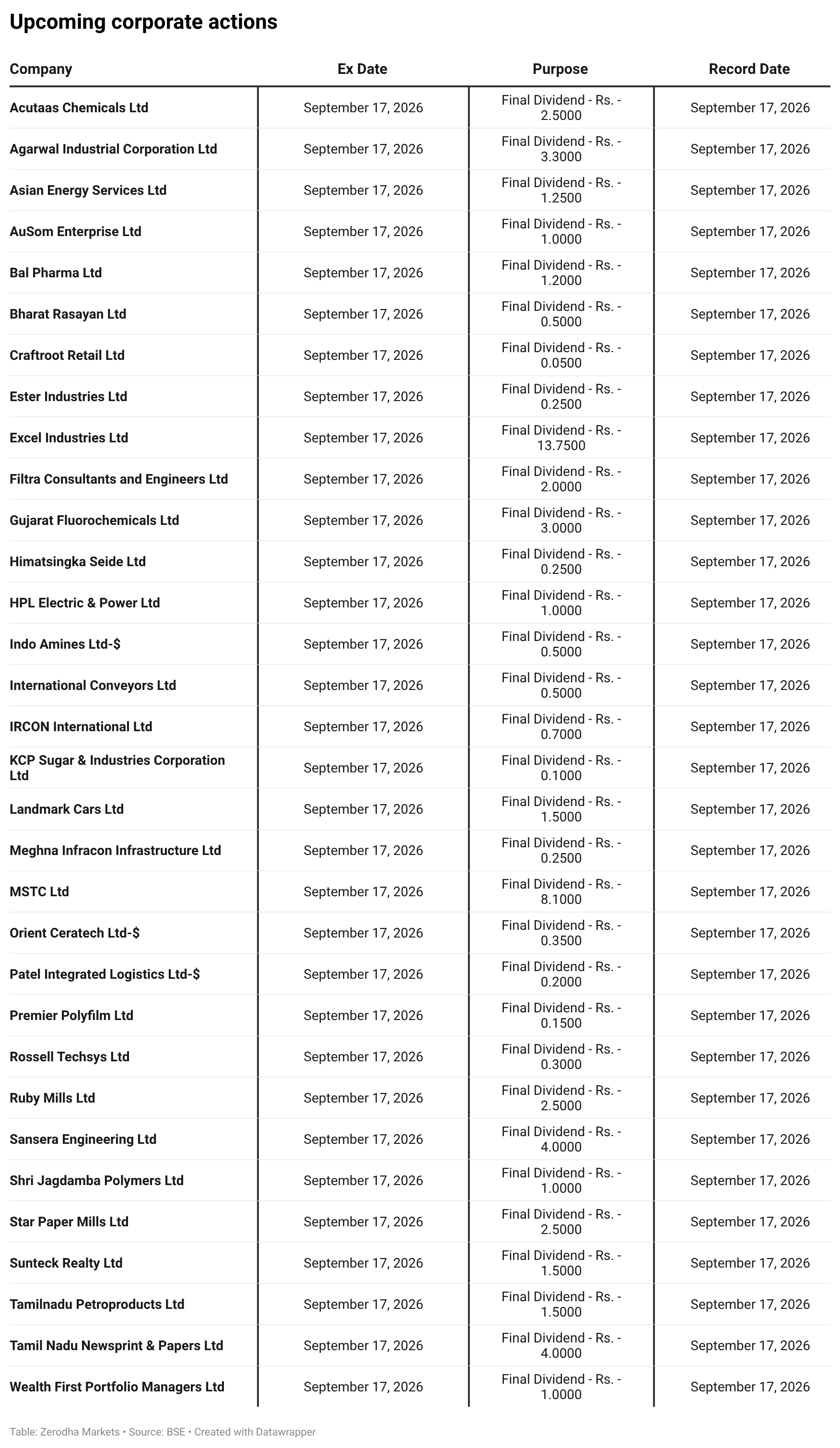
Corporate Actions & Events
Events
September 17 — Euro area Inflation (Final)
A key input for European rate expectations.September 17 — Bank of England policy decision
Could influence UK rates, sterling and broader global markets.September 18 — Bank of Japan policy decision
Worth watching for its impact on Japanese yields, the yen and global liquidity.
Corporate Actions
Published by Zerodha. Not investment advice. Data from NSE, BSE, and MCX.
In our latest episode of In The Money by Zerodha, we break down what market depth and order flow charts actually show you — and what they don’t.
Market depth is a book of intentions: resting orders that may never get executed. Order flow looks at trades that have already happened and tries to measure buying and selling pressure through metrics like delta and cumulative delta.
But where do these numbers come from? Especially in India, where exchanges don’t explicitly tag which side crossed the spread, some of what you see is observed, while some is inferred.
In this edition, we explain how these tools work, how the numbers are constructed, and what they can actually tell you about the market.
That’s it from us for today. We’d love to hear your feedback in the comments, and feel free to share this with your friends to spread the word!
The data and charts are too of overload. It should be made simple and enable quick understanding by a reader. In some charts legend used are not correlated. The presentation should be designed address the audience’s needs and usefulness.
The change in the format is good, but I would like to suggest making a section that covers geopolitical situations in detail.